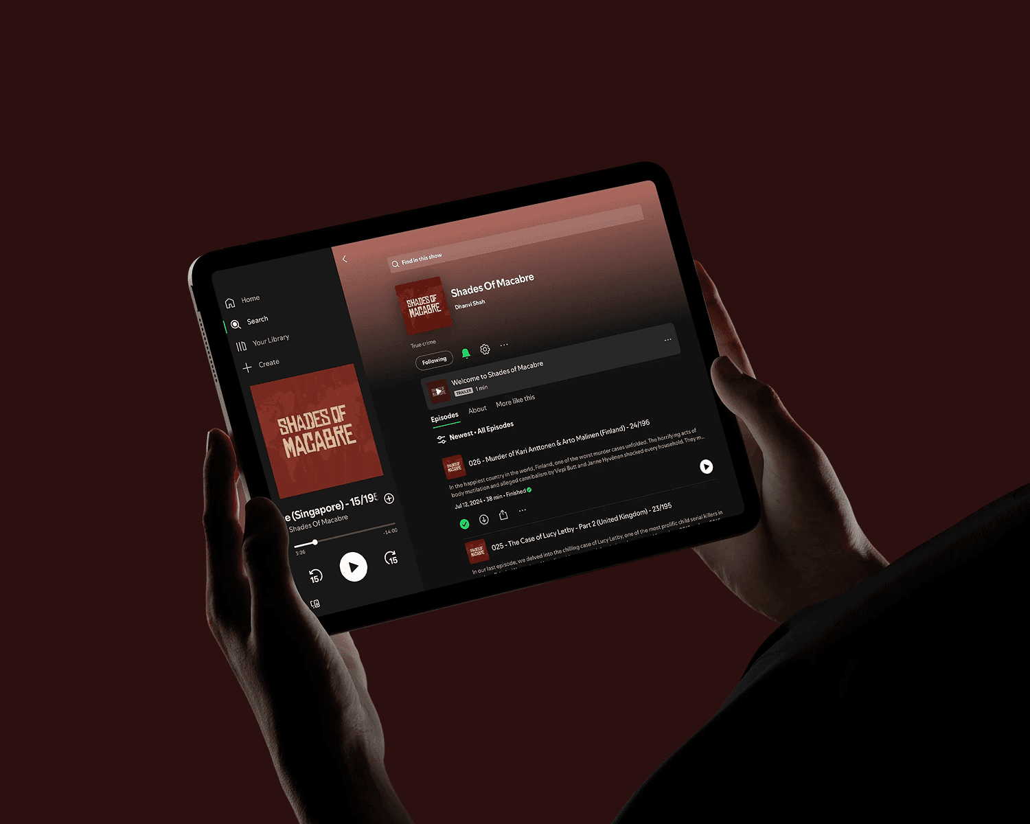
Shades of Macabre is a true crime podcast that explores the unsettling, the obscure, and the deeply disturbing stories hidden in the darker corners of history and society.

Client
Dan
CAtegory
Brand Identity
Product Duration
4 Weeks
Project Overview:
Shades of Macabre is a true crime podcast that explores the unsettling, the obscure, and the deeply disturbing stories hidden in the darker corners of history and society. Every episode takes listeners on a journey through real-world horrors — from cold cases and unsolved mysteries to infamous killers and historical atrocities.
Our role was to create a powerful, story-driven visual identity that captured the podcast’s dark, investigative nature without falling into typical cliché horror tropes. From the name to the logo system, our work helped define the brand’s presence and set the stage for growth across streaming platforms and social channels.
Project Scope:
Brand Naming & Positioning
Primary & Secondary Logo Design
Visual Identity System & Colour Palette
Social & Podcast Cover Artwork Design
Design Approach:
The visual identity leans into bold, uneasy forms inspired by true crime’s raw and unsettling nature. The primary logo uses distressed typography with sharp edges and irregular cuts, reflecting the fractured and chaotic essence of the stories being told. Subtle hints — like the knife motifs and tape-inspired backgrounds — suggest criminality and investigation without resorting to overt visuals.
A versatile secondary logo (SOM) was also developed for flexible use across podcast artwork, thumbnails, merchandise, and social media, ensuring consistency across all brand touchpoints.
Visual Language:
The colour palette draws from deep burgundy and muted bone tones to evoke the feeling of aged case files, bloodstains, and forensic archives. Paired with textured backgrounds reminiscent of wrinkled evidence bags or crime scene tape, this palette sets a sombre, immersive mood.

Ongoing Growth Support:
We continue to shape Shades of Macabre as it expands into new formats and channels, providing ongoing creative support across:
Social media visual assets
Podcast cover refreshes and seasonal design updates
Merchandising concepts and packaging design
Episode promotional graphics and templates
Through a deeply considered brand identity and scalable design system, Shades of Macabre now has a distinctive, instantly recognisable presence — helping the show carve its space in the crowded true crime landscape.